
Better Bites is an all organic dog treat company with the mission to keep dogs healthy with their treats as well as providing an enormous amount of help to dogs in need through proceeds raised from sales, events, and fundraisers.


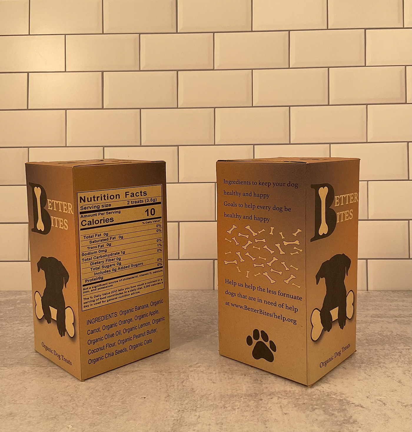
These first two pictures show both the front (left box) with the logo, lettering, and main icon and back (right box) with the mission statment.


The next three pictures show various angles to show all sides of the box together.

The front side includes the big bold logo and lettering and this is paired with the largest silhouette of a dog paired with a bone I thought these bigger bold figures and being so dark with the splash of white for contrast would really catch the eye f customers especially on a shelf full of mostly very colorful brands it could stand out being different and again organic and bold. The flap to the furthest right would be the back side and I chose the mission statement to go there as I felt it was most important along with the overall brand to pass the message, and this is complimented by icons of two cheerful dogs together. The furthest left flap reiterates what we are all about with a link to offer that so wanted help, and of course we have the other middle flap with the very important and very healthy nutritional facts and ingredients. Lastly we have our separate simple icons to leave a nice touch of the brand on top without being too overwhelming.

The name Better Bites came about after thinking about the companies goals on both hands for health and well being of dogs over all. Initially I leaned towards using a double B in the logo but I decided the B with the negative space depicting a bone was much cleaner and was also very straightforward about what we do. I wanted to use a bold B while the rest of the word was kept with a nice clean and simple font. I knew I wanted to use a mix of tan colors because it meshed well with our promise of organic products, and what better color to pop off of the tan than a jet black which carried over to my silhouette type icons, and of course the tan and black are complimented by a touch of charcoal grey to bring them together.

